Document Design
The Power of Design
Good design doesn’t happen by chance. It’s rooted in principles that balance aesthetics with functionality. Design principles like alignment, proximity, contrast, and hierarchy organize content in ways that feel intuitive and visually appealing. These principles ensure that key messages stand out while secondary information supports the overall narrative.
Alignment creates order by anchoring elements to a grid or an invisible line, ensuring consistency. Proximity groups related elements together, helping readers make logical connections. Contrast emphasizes differences between elements, such as bold headings against lighter text, drawing attention to what matters most. Finally, hierarchy structures content, leading the reader naturally from one idea to the next.

The Grid and the Golden Rectangle
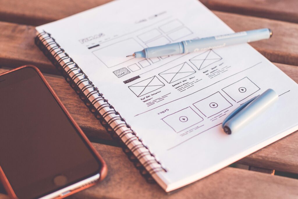
A foundational tool in document design is the grid, a system that divides a page into sections for placing text, images, and other elements. The grid ensures balance, consistency, and structure, making the content easy to navigate.
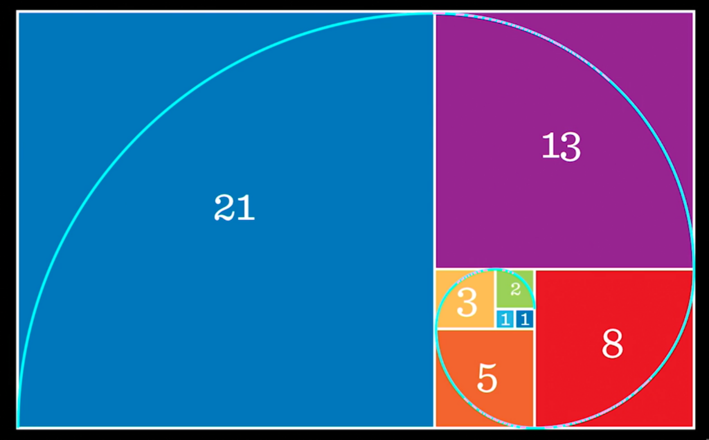
Among grid systems, the golden rectangle stands out for its timeless appeal. Rooted in the mathematical ratio of 1:1.618, the golden rectangle creates layouts that feel harmonious and naturally pleasing. Whether designing a report, a brochure, or a webpage, grids and proportional ratios guide designers in crafting layouts that are as functional as they are beautiful. We can find the golden ratio in nature as depicted below.

The Role of Typography
Typography is more than choosing a font—it’s about setting a tone and enhancing readability. Text formatting, styles, and typographic conventions work together to make documents both engaging and accessible.
- Text Formatting: Proper use of headings, subheadings, and bullet points organizes content for quick scanning. Bold and italicized text draw attention to key terms, while consistent font sizes maintain readability.
- Styles: Fonts like serif (e.g., Times New Roman) convey tradition and authority, while sans-serif fonts (e.g., Arial) feel modern and clean. Pairing fonts thoughtfully can create contrast without clutter.
- Typographic Conventions: Following conventions like maintaining sufficient line spacing (leading) and appropriate letter spacing (kerning) prevents text from feeling cramped or overwhelming.
Typography doesn’t just display words—it amplifies their meaning. For example, large, bold titles can command attention, while understated body text ensures smooth reading.
I encourage you to review the details of my Design Portfolio Project and visit its Deliverables page.

Design Portfolio Project
Situation
As part of my Designing Technical Documents course, I was tasked with creating a digital portfolio to showcase my technical writing and design skills. The course focused on developing proficiency in Adobe Creative Cloud tools (Acrobat, Illustrator, InDesign, Photoshop), Canva, and applying design principles to produce professional, interactive documents.
The goal of the portfolio was to demonstrate to potential employers my ability to:
- Recognize design flaws (design sins) and correct them.
- Apply essential design principles like alignment, contrast, and balance.
- Use technology to create interactive, visually appealing documents.
Task
My task was to design a digital PDF portfolio meeting the following requirements:
- Include at least eight original projects, each showcasing unique design skills.
- Create a polished, professional cover with a personal monogram logo.
- Incorporate interactive features such as bookmarks, hyperlinks, and a linked table of contents.
- Demonstrate a mastery of typography, color theory, grids, and document interactivity across single- and multi-page designs.
- Explain the tools and methods used for each project through succinct, insightful descriptions.
Action
- Learning Design Tools and Principles
- Studied essential resources like White Space is Not Your Enemy and video tutorials for Adobe Creative Cloud tools and numerous required readings (articles).
- Mastered InDesign for layout design, Acrobat for interactivity, Photoshop for image editing, Illustrator for monogram creation and Canva for infographic design.
- Practiced identifying and correcting design sins while applying principles like proximity, alignment, and consistency.
- Single-Page and Multi-Page Designs
- Designed single-page documents using Hagan and Golombisky’s “Works-Every-Time” layout, emphasizing the balance between signal and noise.
- Created multi-page documents with grids to establish visual hierarchy and purposeful layouts, adding interactive elements through Acrobat.
- Typography, Color, and Images Designs
- Studied typography to convey tone and emotion, aligning typeface choices with the document’s purpose.
- Designed CMYK and RGB color palettes to enhance documents for both print and digital formats.
- Edited images in Photoshop using layers, masks, and tools to improve clarity and appeal.
- Logo and Infographic Design
- Used Illustrator to create a personal monogram logo reflecting my brand identity.
- Designed and refined infographics incorporating best practices to present complex data visually.
- Portfolio Development
- Curated and formatted projects into a cohesive portfolio, including a polished cover and interactive features like hyperlinks, bookmarks, and a linked table of contents.
- Used grids to organize document placement, ensuring consistency and a professional look.
Result
The completed portfolio demonstrated:
- Technical Mastery: Proficient use of Adobe Creative Cloud tools to design interactive, visually compelling documents.
- Design Expertise: Application of design principles to identify and correct flaws while creating balanced, professional layouts.
- Interactivity and Engagement: Seamless integration of bookmarks, hyperlinks, and navigable elements enhanced usability.
- Professional Versatility: A variety of projects, including single-page designs, multi-page documents, and infographics, showcasing adaptability across formats.
Skills
The portfolio positioned me as a strong candidate for roles in technical writing, content design, and digital publishing with knowledge and experience of:
- Design: principles, grid use, typography, color theory, monogram logo and infographic design, document interactivity, design analysis, and revision.
- Tools: Adobe Creative Cloud (Acrobat, Illustrator, InDesign, Photoshop) and Canva
let’s start building something!
Use the details to the right to get hold of me.
Virtual Office
2950 Unity Drive
Houston, Texas 77237
Hours
Mon-Fri: 9am – 6pm